- Why traditional reporting struggles to keep up with modern airport demand?
- How AIS and Power BI turn raw ALDIS data into live insights?
- Breaking down the metrics that matter
- Faster insights for busy airport teams without the need for data experts
- More accurate financial reporting with less manual effort
- Conclusion
- FAQs
Airport leaders often have too many metrics scattered all across the place. The problem is not a lack of data; it is how that data arrives on your desk. If your critical information is stuck in a flat file or a printed page, it’s hard to notice the small changes that matter most. This is why AIS is moving the industry toward interactive airport reporting.
Instead of just reading about what happened yesterday, you can now see what is happening right now. This change helps teams make faster, smarter choices without the stress of digging through endless pages.
Previously, ALDIS only had the capability to pull reports as PDFs and excel files. While these documents are accurate, they are static. They tell you what happened, but they don’t let you ask “why.” Recently, AIS has introduced dynamic Microsoft Power BI dashboards that let you filter, click, and look deeper into your data instantly. This is not a design upgrade. It is a fundamental shift in how you manage and analyse your day-to-day traffic.
Why traditional reporting struggles to keep up with modern airport demand?
Traditional reporting usually involves a “snapshot.” A system gathers data, someone runs a report, and a PDF is created. It tells you what happened in the past. But an airport is a living thing. It changes by the minute, not by the month.
As a result, when data is stuck in a static file, you lose the ability to ask “Why?” and make predictive decisions. If you see a spike in “Transfer” passengers, you can’t click on that number in a PDF to see where they came from or which airline brought them in. You have to go back to the system, run a new report, and wait again.
Consequently, this creates a lag in decision-making. In a high-pressure environment, the manual extraction and manipulation of data creates a bottleneck that slows down the entire decision-making process.
Also, the main drawback of traditional documents is that they lack the flexibility of interactive airport reporting. Meaning- Airport managers often have to cross-reference multiple files just to understand a single trend.
How AIS and Power BI turn raw ALDIS data into live insights?
We have integrated Power BI directly into our ALDIS platform to change how you see your airport. Think of it as moving from a paper map to a GPS. Instead of a static graph, you have a tool that gets you interactive data visualisers with more visibility over data.
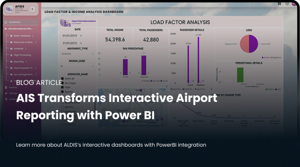
Picture: New ALDIS Screen with Power BI Visualisers
The new AIS dashboard brings every key metric into one place. You no longer need to extract five different reports to understand your “Load Factor” or your “Income Analysis.” It is all there, visualised in a way that makes sense the moment you look at it.
By removing the manual steps between the database and the user, we have created a system for interactive airport reporting that feels as fast as the airport itself.
Simple yet Powerful data visibility
In the past, the finance team had their reports, and the operations team had theirs. This often led to “data silos” where different departments weren’t seeing the same story. While we provide a unified source of truth, access is still carefully controlled; only authorised users can view the specific reporting dashboards relevant to their department’s operations.
However, with our new interactive setup, everyone looks at the same screen. Whether you are tracking “Total Income” or “Adult Pax Percentage,” the data comes from the same source. This builds a level of trust across the organisation. When everyone sees the same numbers, meetings become about solving problems rather than arguing over whose information is accurate.
Breaking down the metrics that matter
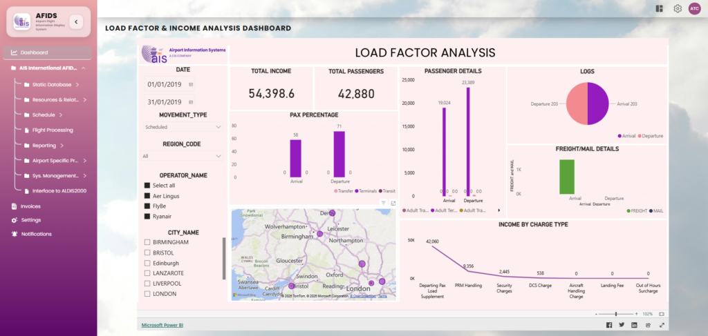
Let’s look at how this works in practice. For example, our “Load Factor & Income Analysis” dashboard is designed to give you a “birds-eye view” of your airport’s health.
1. Passenger details at a glance
Instead of reading a table of numbers, you can see your passengers as visual blocks. You can instantly see the split between:
- Terminal Passengers: Those starting or ending their journey at your airport.
- Transit Passengers: Those staying on the same aircraft.
- Transfer Passengers: Those moving between flights.
Why does this matter?
Because if you see a sudden rise in transfer passengers, you might need to adjust your retail strategy or security staffing in specific zones. With a quick filter, you can see which operators are driving that growth.
2. Income by charge type
Managing airport revenue is complex. There are runway fees, ILS (Instrument Landing System) approach charges, parking fees, and more. In a standard report, these are just rows of figures.
In the new AIS dashboard, these are displayed as a clear trend line. You can see exactly which services are bringing in the most revenue and which ones are underperforming. For instance, if your “SRA Approach” income is lower than expected, you can drill down into the dates and operators to find out why.
3. Visualising the world
Our dashboard includes a global map view. This isn’t just for show. It allows you to see the geographic spread of your traffic. By seeing where your flights are coming from, be it North America, Europe, or Asia, you can better understand your market share and identify new opportunities for route development.
Faster insights for busy airport teams without the need for data experts
The biggest benefit of this shift is speed. We call this “Time to Insight.” This is the gap between a problem happening and a manager understanding how to fix it.
When you use an interactive dashboard, that gap shrinks. You don’t have to be a data scientist to use these tools. We have built the interface to be intuitive. If you want to see data for a specific date range, you just pick it from a calendar. If you want to see how a specific airline is performing, you click on the airline company’s name.
The system does the heavy lifting. It filters thousands of records in real-time and updates every chart on the screen. This means your morning briefing can be based on data from an hour ago, not a week ago.
In short, this speed is the hallmark of interactive airport reporting, as it reduces the ‘time to insight’ from days to seconds.
More accurate financial reporting with less manual effort
Manual data entry and extraction are where mistakes happen. When a staff member has to copy numbers from one system to a report, there is always a risk of human error. Over time, these small errors can lead to a bigger impact.
This is because the AIS dashboard pulls directly from the ALDIS system, the risk of human error is almost gone. The data is accurate because it is direct. There is no middleman and no manual “copy-pasting.” You get the raw truth of your airport’s performance, presented intuitively in real-time.
Conclusion
Moving to interactive airport reporting is about more than just modern data visualisers; it is about changing how your team works every day. When data is easy to find, people use it more, which naturally builds a culture where everyone feels confident finding their own answers.
This shift means your team can stop wasting hours digging through static, 40-page documents and instead spend that time acting on live updates as they happen. Having a single version of the truth keeps finance and operations on the same page, allowing you to spot trends early and plan for future growth with total confidence.
Using simple filters to see exactly what is needed in seconds makes your airport more responsive, turning everyday data into a powerful tool for immediate action.
Take Control of Your Airport Data
ALDIS by AIS provides the foundation for interactive insights your team needs to thrive. By incorporating interactive reports into the platform, we have made it possible to move from manual data extraction to instant, visual analysis of your airport’s performance.
Transition your reporting from static documents to the latest ALDIS interactive update.